New Features
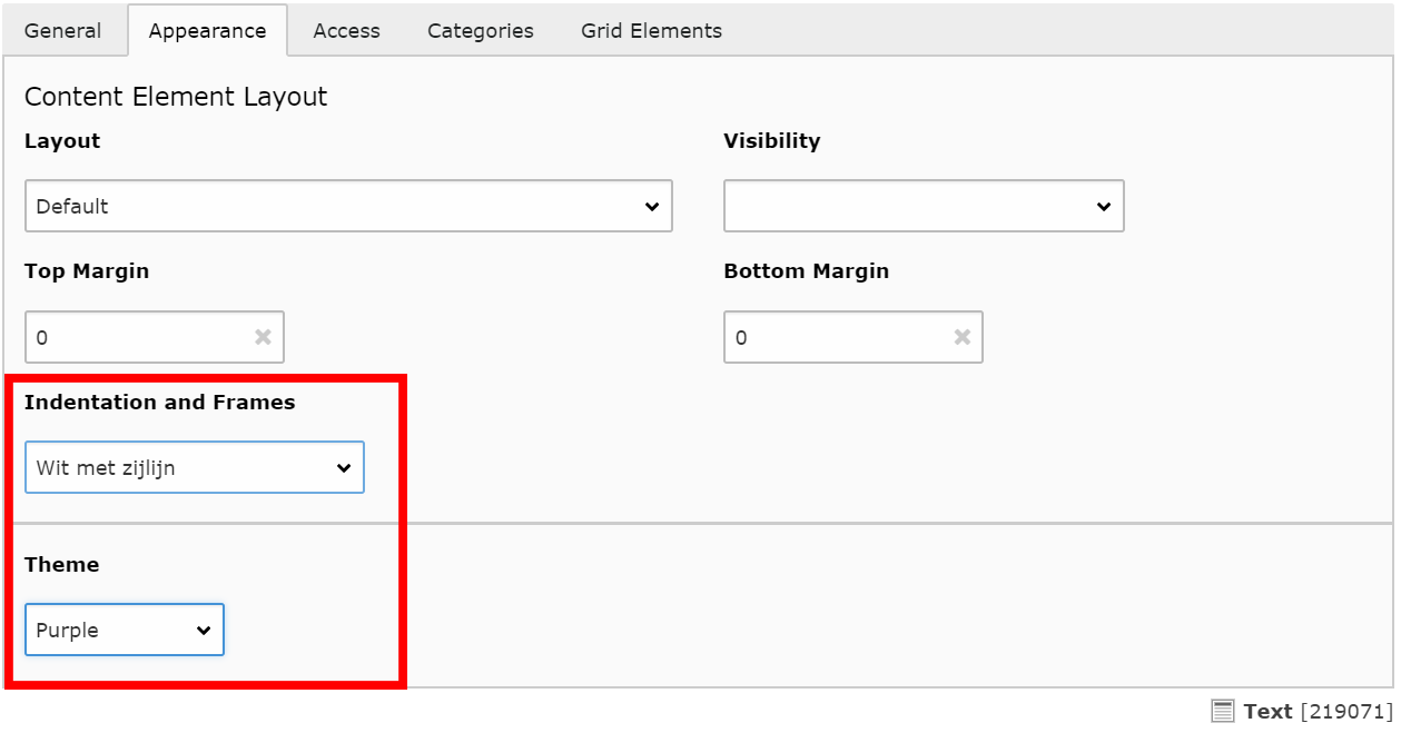
Styling of text element
This is a new styling of text elements. It will give the element a white background, a coloured side bar, and a slightly smaller font. It can be useful to visually distinguish content.
In the element properties, under Appearance, select 'Wit met Zijlijn' and choose one of the TU Delft theme colours:
Dynamic content overview - Card Layout
News and Agenda items are usually displayed in what is called a Dynamic Content Overview. The news / agenda feed on your page is one as well. There are several overview templates available, but there was great demand for a template that displayed the search results in a card layout. This has now been introduced, an example can be seen on the right.
Also, check out more Card Layout display options!
Styling is determined by the available content of the result pages, as well as custom settings in the overview element. All card variations (normal, half height, horizontal, and horizontal half height) are available to choose from, as well as the number of results per row.
Because the overviews are difficult to set up properly, changing from your current template to this new template is not done by editors. Please contact your local content manager to apply for this overview template.


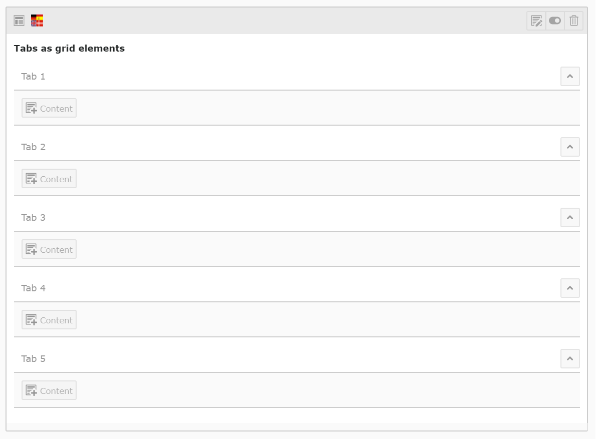
Tabs as Grid Elements
What changed?
Tabs were difficult to manage, especially when you wanted to re-use and swap content from other pages. Therefore, the tab element has been redesigned for a more user-friendly interface, a better overview of the embedded content, and the added possibility to cut/paste and reference elements in it.
The old Tab element still exists and is not automatically replaced, but will be phased out. For this purpose, the old version has been disabled for editing. In the following weeks, we'll be changing all existing Tab Elements to Tabs Grids. Should you however come across an old Tab Element and you find yourself unable to edit it, please contact your local content manager.
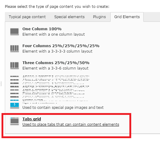
How can I create a new Tabs Grid?
Tabs Grids are created like all other grids. When creating a new element, under Grid Elements, select Tabs grid. This will place a grid on your page with 5 rows, each row representing one of the tabs.
- The Header in the first element of each tab will also be the title of that tab. So for instance, in this case, the Header of this text element ('How can I create ...') is adapted as Tab title.
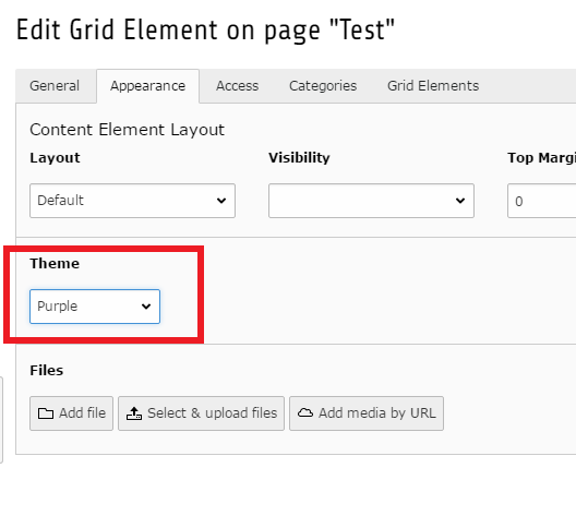
- You can select a colour theme by editing the Tabs Grid properties; under Appearance, select a theme (see fig.)
- If you don't put any content in a tab, it will be invisible.
Any tips and tricks?
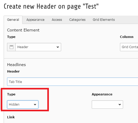
When you don't want to start a tab with a header (for instance, when it's an image), you still need to tell Typo3 which title to use for this tab. You can do so by creating a 'Header Only' element, and under Type, select 'Hidden'. This will not show the header inside your tab, but it will be adopted as Tab title.
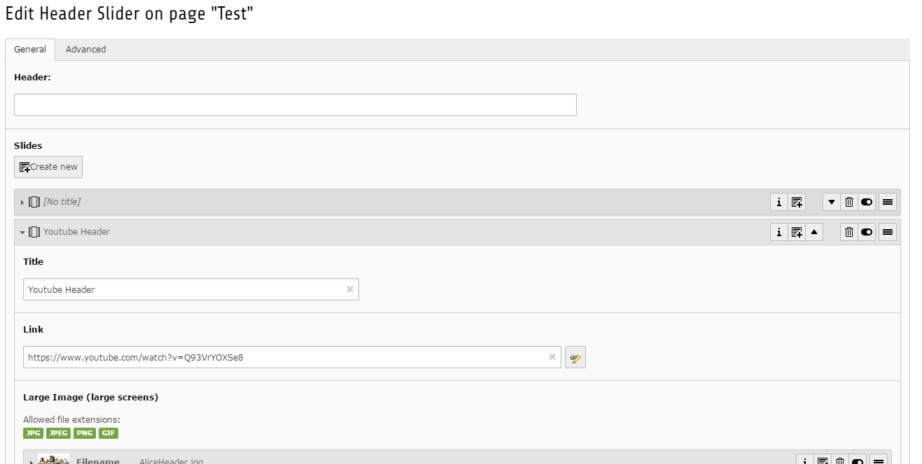
Youtube video in Header Slider
It is now possible to put a video in the Header Slider on top of any page.
If you want to add a Youtube video to your header-slider, just paste the youtube URL in the link field of a slide; a play button will be shown on your slide, and a pop-up style video will play when the button is pushed.
Like all slides, this feature also requires you to upload an image.
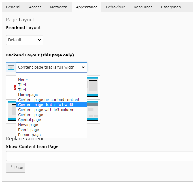
Full Width page template
This page combines the regular Content page with the Homepage. Its features are identical to the Homepage format in many ways, but it adds the bread crumb on top, so visitors can easily find their way back.
This layout was frequently created with a workaround (Content Page with Left Column, combined with specific element settings), which is why an official option has been included instead.
To create this layout, go to the page properties, under Appearance, select the Backend Layout 'Content page that is full width'.
(feature renaming can hopefully be included in our next release)
This page is actually an example of this layout. Click 'To Top' to view the breadcrumb.
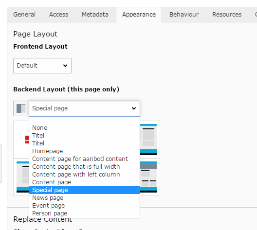
Special Page template
This is another new page template (see: Full Width page template). This layout is designed for a long-read format, by dividing the screen in two halves; the left one is designated for images, the right one for all content. There is also a special connection between picture and content, enabling a nice scrolling experience.
Try it out!
This layout is particularly useful for magazine-style pages.
To create this layout:
- go to the page properties; under Appearance, select the Backend Layout 'Special Page' (see fig.).
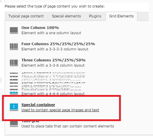
- On this new page, create a new element; under Grid Elements, select Special Container (see fig.). This grid consists of two columns.
- In the left column, you place a 'Special Image' element.
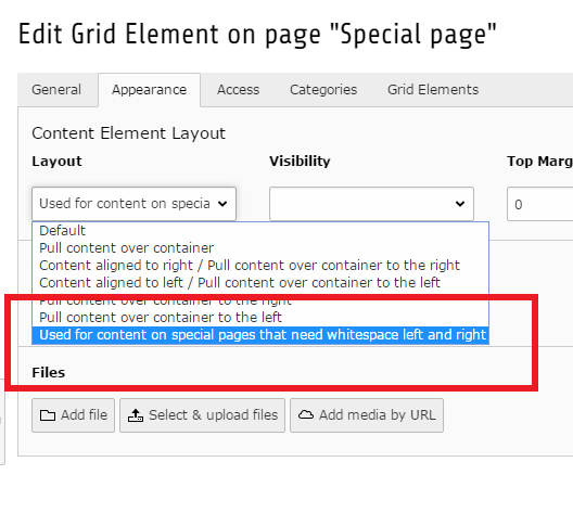
This is the image that is displayed stationary alongside the scrolling content on the right; when the visitor is at the end of the content in this Special Container, the image will scroll up, and display the next Special Container. - In the right column, you place a normal 100% Grid element.
- In the element properties of this Grid Element, under Appearance, select 'Used for content on special pages..' (see fig.).
- Inside this 100% grid, you can place all elements to your liking.
The last steps, creating a 100% grid, are necessary to create the Special layout as it was designed. This element layout compresses the width of the elements within - otherwise, the text would run the entire width of the column.
Facts and Figures element
This is a new element to display, for instance, facts and figures.
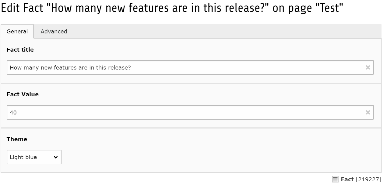
To create this, add a new Fact element inside a grid. Under Theme, select the header colour.
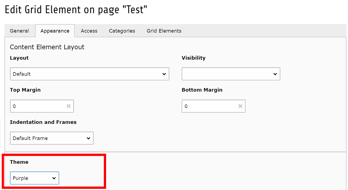
Then, edit the grid properties, go to the tab Appearance, and choose a background colour under 'Theme'.
Please note: the fact element only properly works in combination with this coloured grid background.
Coloured grid background
The background colour feature for grids can also be used without a fact element. It may for instance be useful for magazine-type pages, to highlight a specific text.
Two layout guidelines:
- Dont overdo it! These coloured grids are very dominant. Don't create an abstract piece of art.
- See if you should add top and bottom margins (under Appearance), to prevent the grid from overlapping with other elements.
To create this, edit the grid properties, go to the tab Appearance, and choose a background colour under 'Theme':
Notification element
This element can be used to draw attention to a certain part of your website, or a call-to-action (for instance, when an application deadline is approaching). You can add one or two buttons. The element is available in all TU Delft theme colours.
To create this, add a new Notification element. Enter a header, text, and theme, and, optionally, one or two buttons. The buttons can either be white or transparent.
Notification element
These are not the only release notes; they are only the new elements. Check out our improvements and bug fixes!
Improvements Bug fixesRead More-toggle
This option allows you, in a Text element, to hide paragraphs under a 'read more'-line (as seen below).
To create this, in the Rich Text Editor (RTF) of the Text element, stand in the text on the desired location. Click on 'Insert Custom Element', then 'Tudelft', then 'Insert Readmore'. An orange marker will appear in your text.
To demonstrate this, a piece of literary history:
Alice
There was a table set out under a tree in front of the house, and the March Hare and the Hatter were having tea at it: a Dormouse was sitting between them, fast asleep, and the other two were using it as a cushion, resting their elbows on it, and talking over its head. ‘Very uncomfortable for the Dormouse,’ thought Alice; ‘only, as it’s asleep, I suppose it doesn’t mind.’Read more
The table was a large one, but the three were all crowded together at one corner of it: ‘No room! No room!’ they cried out when they saw Alice coming. ‘There’s plenty of room!’ said Alice indignantly, and she sat down in a large arm-chair at one end of the table.
‘Have some wine,’ the March Hare said in an encouraging tone.
Alice looked all round the table, but there was nothing on it but tea. ‘I don’t see any wine,’ she remarked.
‘There isn’t any,’ said the March Hare.
‘Then it wasn’t very civil of you to offer it,’ said Alice angrily.
‘It wasn’t very civil of you to sit down without being invited,’ said the March Hare.
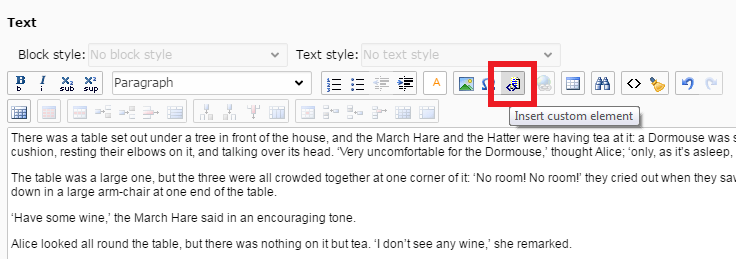
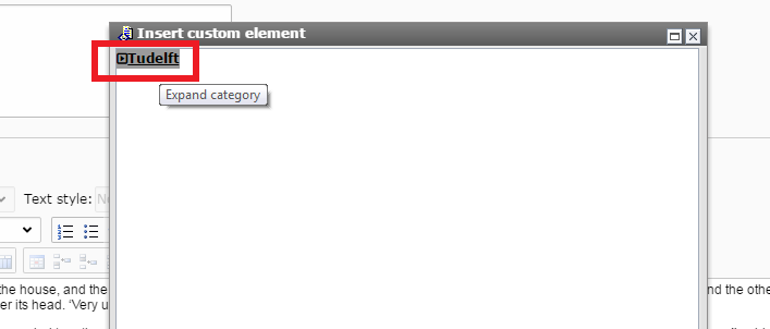
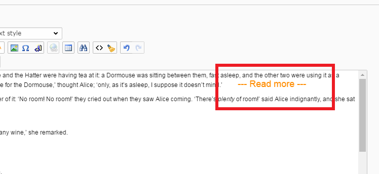
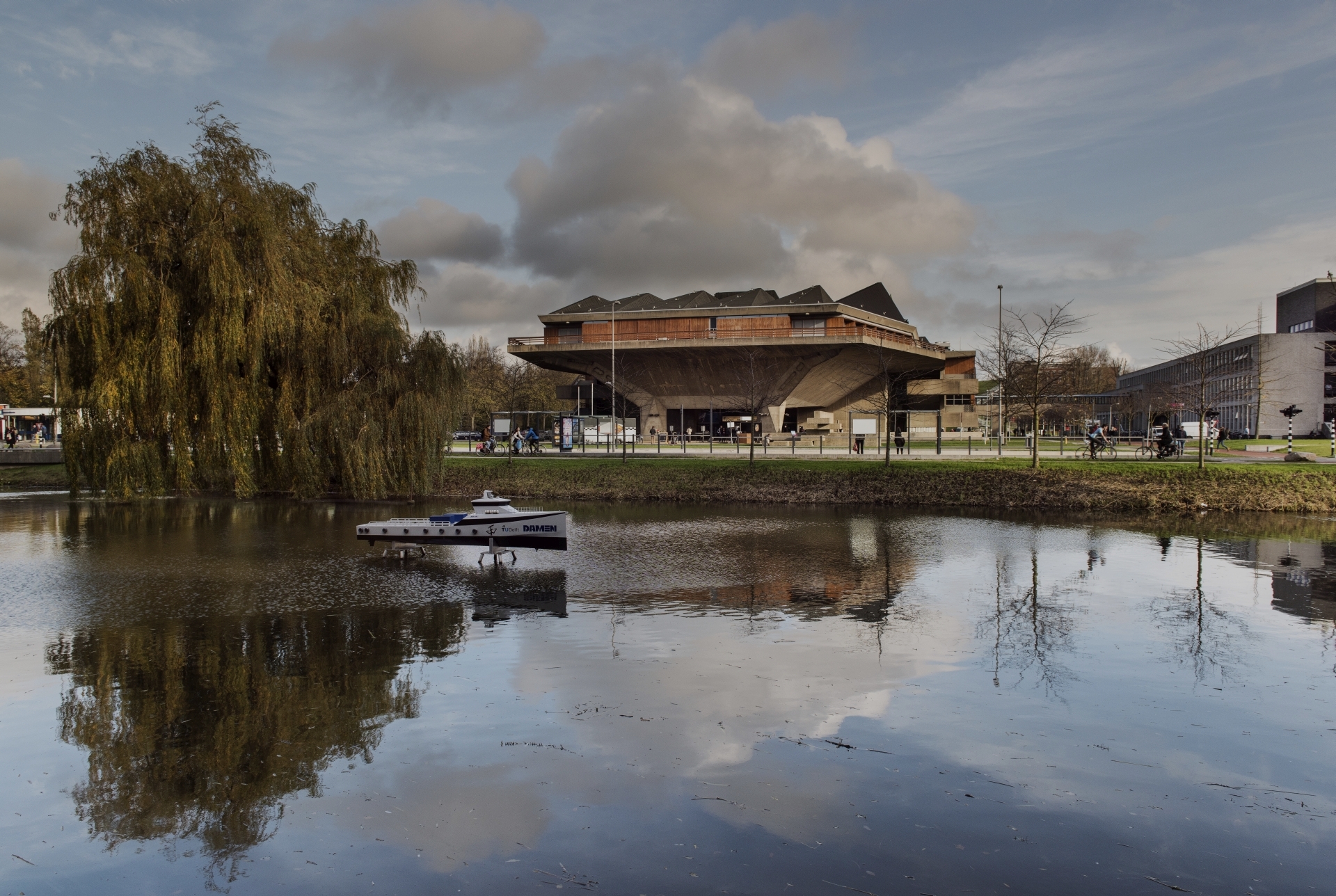
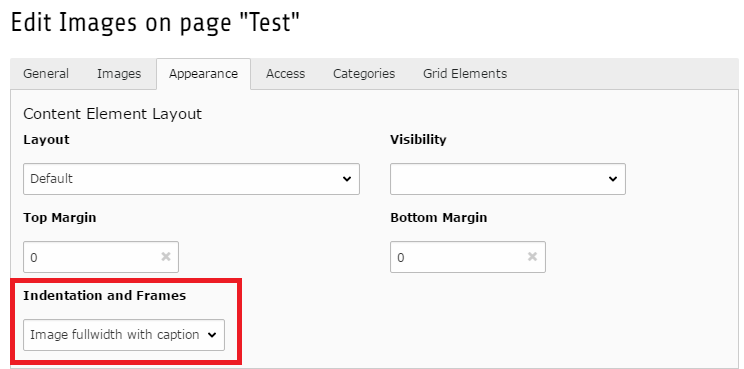
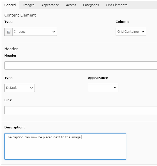
Image side caption
An option has been added to display a caption next to an image. This was a feature in the original design, and works well in storytelling articles.
To create this, go the the element properties, under Appearance, and choose 'Image fullwidth with caption'.
On the General tab, under Description, fill in the caption text.